Introduction to uplift
In traditional binary classification, we attempt to predict a binary outcome \(y\) based on some set of features \(X\). Consequently, our success criterion is usually something that measures how well we can predict \(y\) based on values of \(X\) (e.g. accuracy, precision, recall). In uplift modeling, however, the story is quite different, because while we are still trying to predict the outcome \(y\), we want to predict this outcome conditioned on a treatment. In other words, we want to find individuals for whom the effect of our treatment is largest.
To understand the practical ramifications of this constraint, consider a simple decision tree model. In a decision tree, splits are chosen to maximize the homogeneity of nodes. In the context of advertising, for an outcome model, this would mean finding splits that separate those who would visit our website from those who wouldn’t. In uplift modeling, the split needs to be chosen to take into effect the treatment, and so, we want to sort out those who would visit our website only when shown an ad (serving an ad is useful) from those who would visit our website regardless (serving an ad is useless).
The conceptually simplest way to do this is to change the splitting criterion, but because many of sklearn’s built-in implementations do not allow for a custom split criterion/optimization function, this is not completely trivial. While we could recreate each method to allow for this customized uplift criterion (and others have done this), we have discovered that sklearn is blazingly fast, and in making a homebrew algorithm, we’d sacrifice some of the benefits (efficient hyperparameter tuning) that come with speed (the other algorithms we have encountered are, regrettably, slow). Thus, we seek alternate methods that allow us to leverage sklearn (and other) modules. In particular, we implement methods here that simply transform the data, but code the Treatment/Control information in the transformed outcome.
The Transformed Outcome
Our package by default implements the Transformed Outcome (Athey 2016) method, defined as:
where \(Y^{*}\) is the Transformed Outcome, \(Y\) is the outcome (1 or 0), \(W\) indicates the presence of a treatment (1 or 0), and \(p = P(W=1)\) (the treatment policy). When \(p = 0.5\), this amounts to labelling (treatment, outcome) pairs as follows:
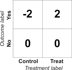
The beauty of this transformation is that, in expectation,
or uplift. Any algorithm trained to predict \(Y^{*}\), then, gives a prediction of uplift.
The Qini curve
Once the model has been made, evaluation is traditionally accomplished using what is known as a Qini curve. The Qini curve is defined as
where \(\phi\) is the fraction of population treated (in either treatment \(t\) or control \(c\), as indicated by the subscripts) ordered by predicted uplift (from highest to lowest). We use lowercase \(n\) to indicate a \(\phi\)-dependent count, and the uppercase \(N\) to indicate a total count (i.e. \(n(1)\)). “Random chance” is therefore a model that cannot distinguish positive and negative uplift and results in a straight line from \((0,0)\) to
The value Q is then the area between the model’s Qini curve and the random chance Qini curve. Q has been used throughout the literature as a way of measuring how good a model is at separating positive and negative uplift values. However, a problem with this curve that its absolute value is dependent on how people generally respond to your treatment. Consequently, it is not particularly useful in understanding how much of the potential uplift you have captured with your model. To this end, we generally normalize Q in a two different ways:
q1:Qnormalized by the theoretical maximal area.q2:Qnormalized by the practical maximal area.
The theoretical maximal curve corresponds to a sorting in which we assume that an individual is persuadable (uplift = 1) if and only if they respond in the treatment group (and the same reasoning applies to the control group, for sleeping dogs). The practical max curve corresponds to a similar sorting, for which we also assume that all individuals that have a positive outcome in the treatment group must also have a counterpart (relative to the proportion of individuals in the treatment and control group) in the control group that did not respond. This is a more conservative, realistic curve. The former can only be attained through overfitting, while the latter can only be attained under very generous circumstances. Within the package, we also calculate the “no sleeping dogs” curve, which simply precludes the possibility of negative effects.
To evaluate Q, we predict the uplift for each row in our dataset. We then order the dataset from highest uplift to lowest uplift and evaluate the Qini curve as a function of the population targeted. The area between this curve and the x-axis can be approximated by a Riemann sum on the \(M\) data points:
where
and so
We then need to subtract off the randomized curve area which is given by:
and so the Qini coefficient is:
Alternate Qini-style curves
Unfortunately, with the Transformed Outcome method, there is a real risk of overfitting to the treatment label. In this case, the Qini curve as defined above could give values that are deceptively inflated. To correct for this, we implemented two alternate Qini-style curves. First, the Cumulative Gain Chart (Gutierrez 2017) finds the lift within the subset of the population up to \(\phi\), then multiplies this by \(n_t(\phi) + n_c(\phi)\) to scale the resulting lift to the scale of global impact:
In our formulation, we multiple by \(\phi\) instead, as follows, so the y-axis matches the y-axis of the Qini curves.
Note we simplified the notation, replacing \(y=1\) above with simply \(1\) in the subscripts of \(n\).
Alternatively, we also implement what we call the Adjusted Qini curve, which we define as follows:
We emphasize that the cumulative gains chart is less biased than the adjusted Qini curve, but the adjusted Qini can be useful when the percentage targeted is small and treatment group members are valued disproportionately higher. In such a case, the adjusted Qini overvalues treatment group information to prevent overspending.
References
Athey, S., & Imbens, G. W. (2015). Machine learning methods for estimating heterogeneous causal effects. stat, 1050(5).
Gutierrez, P., & Gérardy, J. Y. (2017, July). Causal Inference and Uplift Modelling: A Review of the Literature. In International Conference on Predictive Applications and APIs (pp. 1-13).